Universal Yums — UX Overhaul
Building a design system from zero, redesigning the customer journey, and establishing brand consistency across every touchpoint for a global snack subscription company.
This case study is organized around four themes: brand consistency, scalability, workflow efficiency, and transaction potential.
Discovery: Four Interlocking Problems
Universal Yums is a global snack subscription service offering three box tiers — Yum (6+ snacks), Yum Yum (12+ snacks), and Super Yum (20+ snacks) — across rotating international country themes, alongside an à la carte Yum Shop. With subscription lengths from month-to-month to annual gifting plans, the product catalog is rich. The experience serving it was not.
Before designing anything, I audited every customer-facing touchpoint — website, email campaigns, social assets — and assessed the internal design and development workflow. What I found were four distinct but deeply connected problems, each compounding the others.
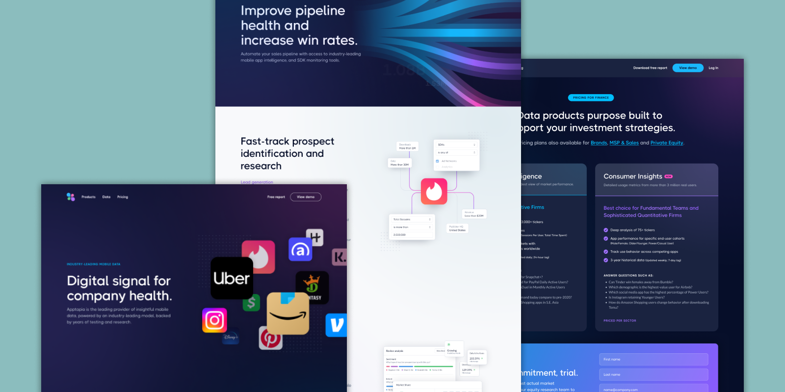
Brand Inconsistency
- Visual language differed between web, email, social, and packaging.
- Old and new design styles coexisted on the same pages with no resolution.
- No shared color tokens, type scales, or component standards existed.
- Four designers were producing four visual directions simultaneously.
Poor UX & Information Architecture
- A mandatory taste quiz gated the entire purchase flow — every customer had to complete it before reaching product selection, regardless of whether they wanted it.
- There was no cart, meaning customers could not add à la carte Yum Shop items to a subscription purchase, could not review a subtotal, and had no opportunity to encounter upsell items.
- The Yum Shop had no presence in global navigation.
Broken Design Infrastructure
- No design system, no 8pt grid, no reusable components anywhere on the site or in email.
- Every element was custom-built from scratch by whoever was working on it that day.
- Emails were sliced images — the entire email exported as a single graphic — making them inaccessible to screen readers, unresponsive on mobile, and impossible to update without rebuilding.
- The concept of a design system was entirely unknown to the team.
Organizational Silos
- Designers, developers, and PMs worked without shared process or feedback loops.
- PMs assigned tasks based on perceived business needs with no UX input.
- No one in the organization held expertise in UX, information architecture, accessibility, or industry-standard design practice.
- The platform stack — WooCommerce on WordPress, no React — imposed additional technical constraints that shaped every recommendation.
My Process
Step 1: Building the Design System from Zero
Before any page redesign or flow work could begin, the team needed a shared foundation. The design system was the highest-leverage intervention available — without it, everything downstream would continue to diverge.
The design system did not exist in any form before this engagement. No style guide. No shared components. No naming conventions. I introduced the concept, made the case for it to stakeholders, and built the entire system from scratch in Figma.
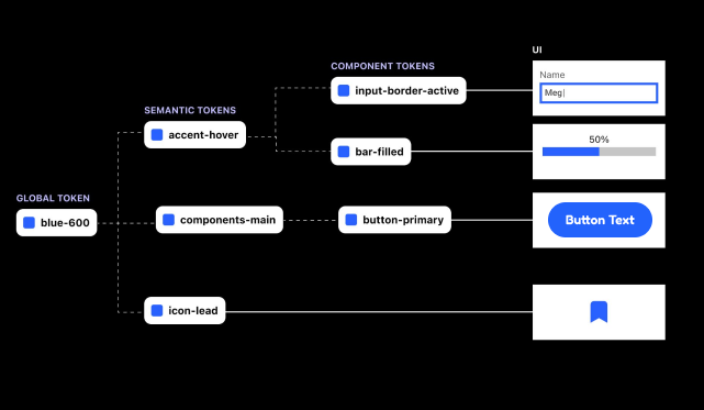
When I shared the initial system with the team — which included tokens, semantic color naming, and a full component architecture — the reaction was telling: it was their first encounter with a design system of any kind, and the complexity was overwhelming rather than empowering. I recognized the problem immediately. A system that a team can’t confidently use or build on isn’t a foundation — it’s just documentation no one reads.
I restructured delivery into two phases. Phase 1, delivered during this engagement, is deliberately approachable: a practical set of building blocks the team could understand, adopt, and contribute to without prior design system experience. I paired the handoff with direct training — walking the team through how to edit colors, apply text styles, and use and create components — so they could work independently and with confidence.
Phase 1 covers:
- Color palette (primary, secondary, and neutral)
- Typography scale (display, heading, body, caption — with clear usage rules)
- Spacing system built on an 8pt grid
- Button states (default, hover, active, disabled, loading)
- Form elements (inputs, selects, checkboxes, radio buttons)
- Card components for products, subscriptions, and content
- Navigation patterns
- Page layout grids for desktop and mobile
Every component follows accessibility standards: WCAG AA contrast ratios, minimum touch target sizes, and documented focus states.
Phase 2 covers:
- Design tokens with semantic naming conventions
- A more scalable component architecture
- Advanced theming and multi-brand support
Scoped and ready to build once the team is comfortable with the fundamentals — giving them a clear path to grow into more advanced practices when they’re ready.
Delivered Work
The following work was designed, documented, and delivered — built and live within the contract period.
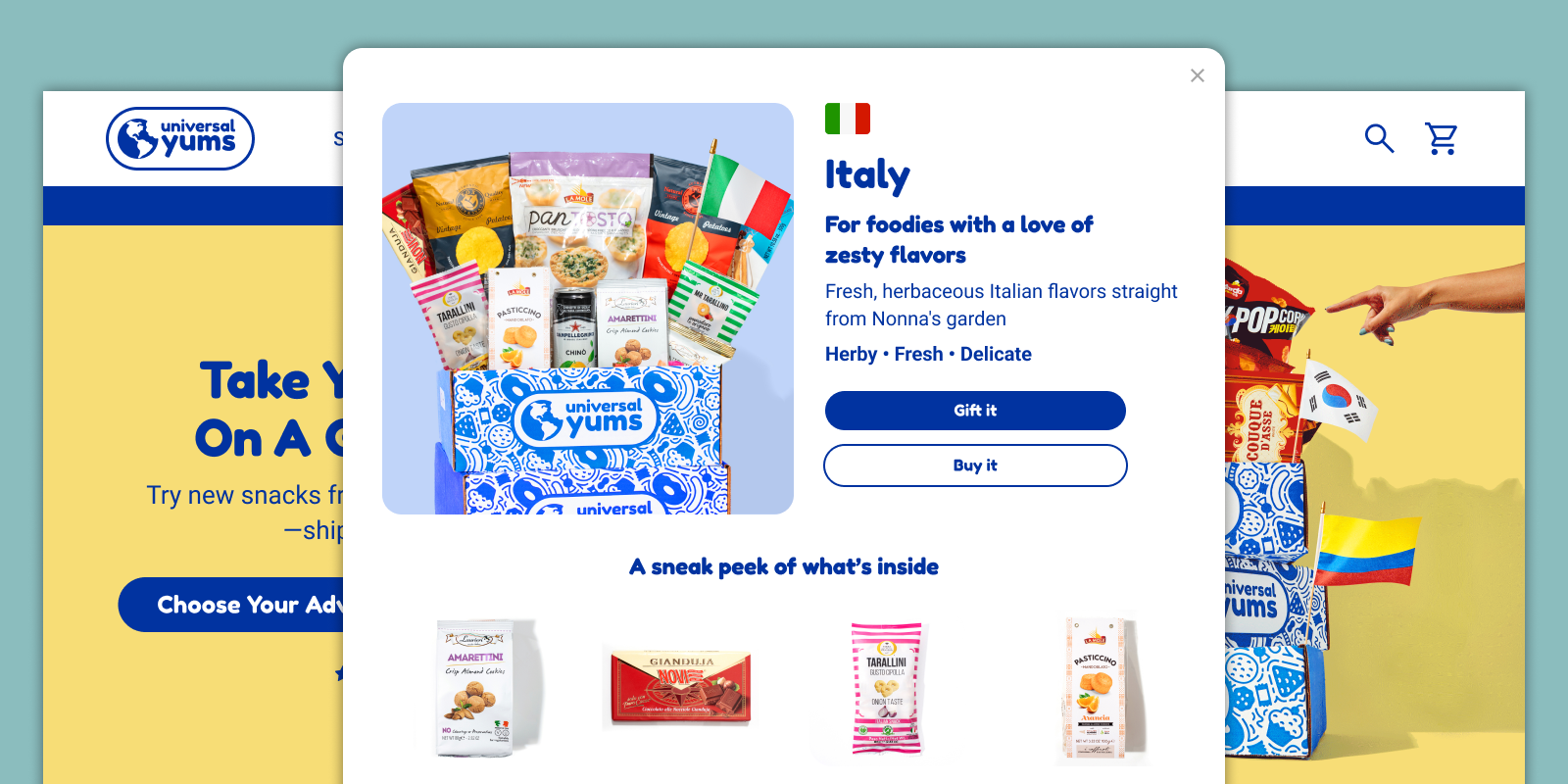
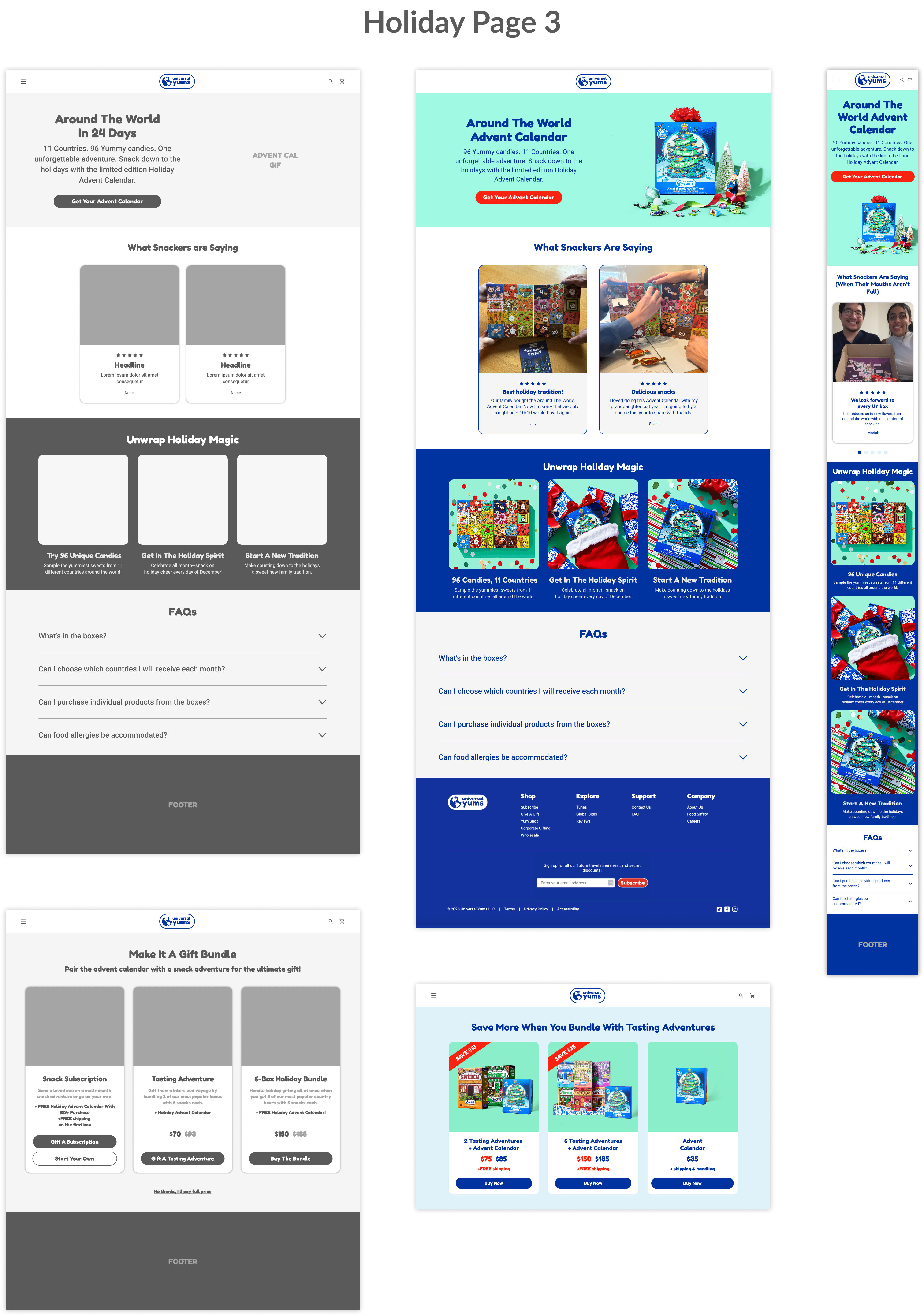
Holiday Landing Pages (×3)
Three simultaneous Christmas campaign pages were designed, each mapped to a specific paid ad creative. Each page reflected the ad a customer arrived from, maintaining message match and reducing drop-off between click and conversion.
A critical insight came from Hotjar session recordings and email click-through data: the majority of Universal Yums customers were opening emails and navigating to the site from their phones. Yet none of the existing pages were designed with mobile in mind. I made mobile-first layout the primary constraint for all three pages — restructuring content hierarchy, touch targets, button sizing, and CTA placement for small screens first, then scaling up.
All three pages were built using the new design system, establishing a reusable campaign template pattern the team can use for future seasonal promotions without starting from scratch.
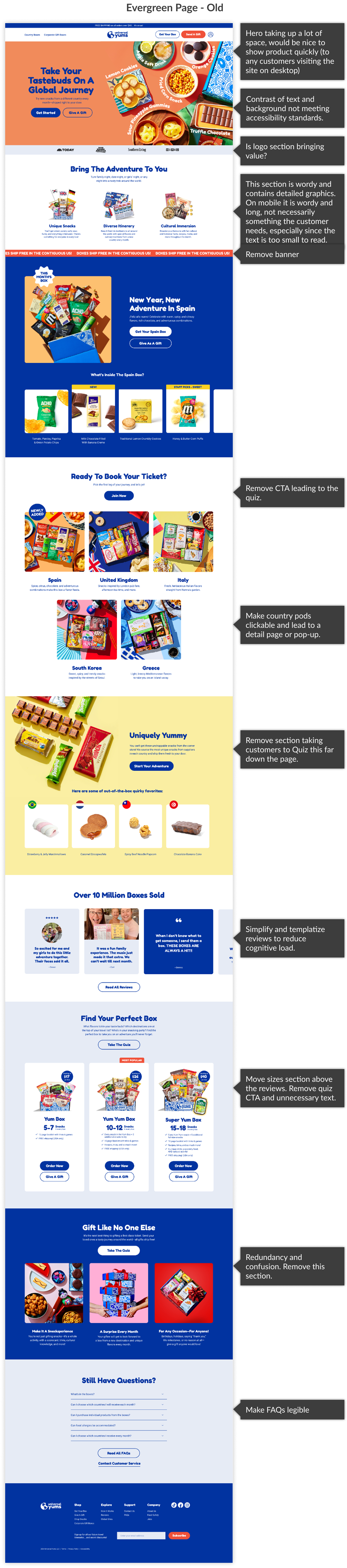
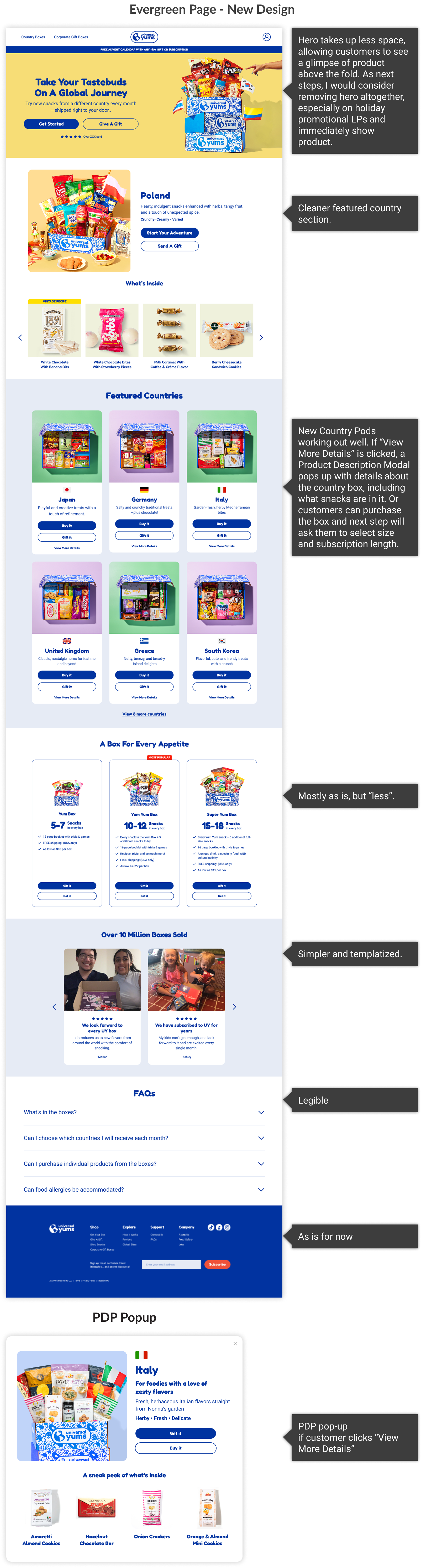
Evergreen Homepage Redesign
The existing homepage accumulated sections over time without a governing content strategy. The result was visual noise, competing calls-to-action, and cognitive overload — a page that worked against conversion rather than for it.
I audited each section against user goals and business objectives, removing content that increased friction without supporting the primary action: choosing a box and starting a subscription. The redesigned homepage applies the design system throughout and establishes a clear content hierarchy. It is more succinct, less overwhelming, and more effective at directing attention.
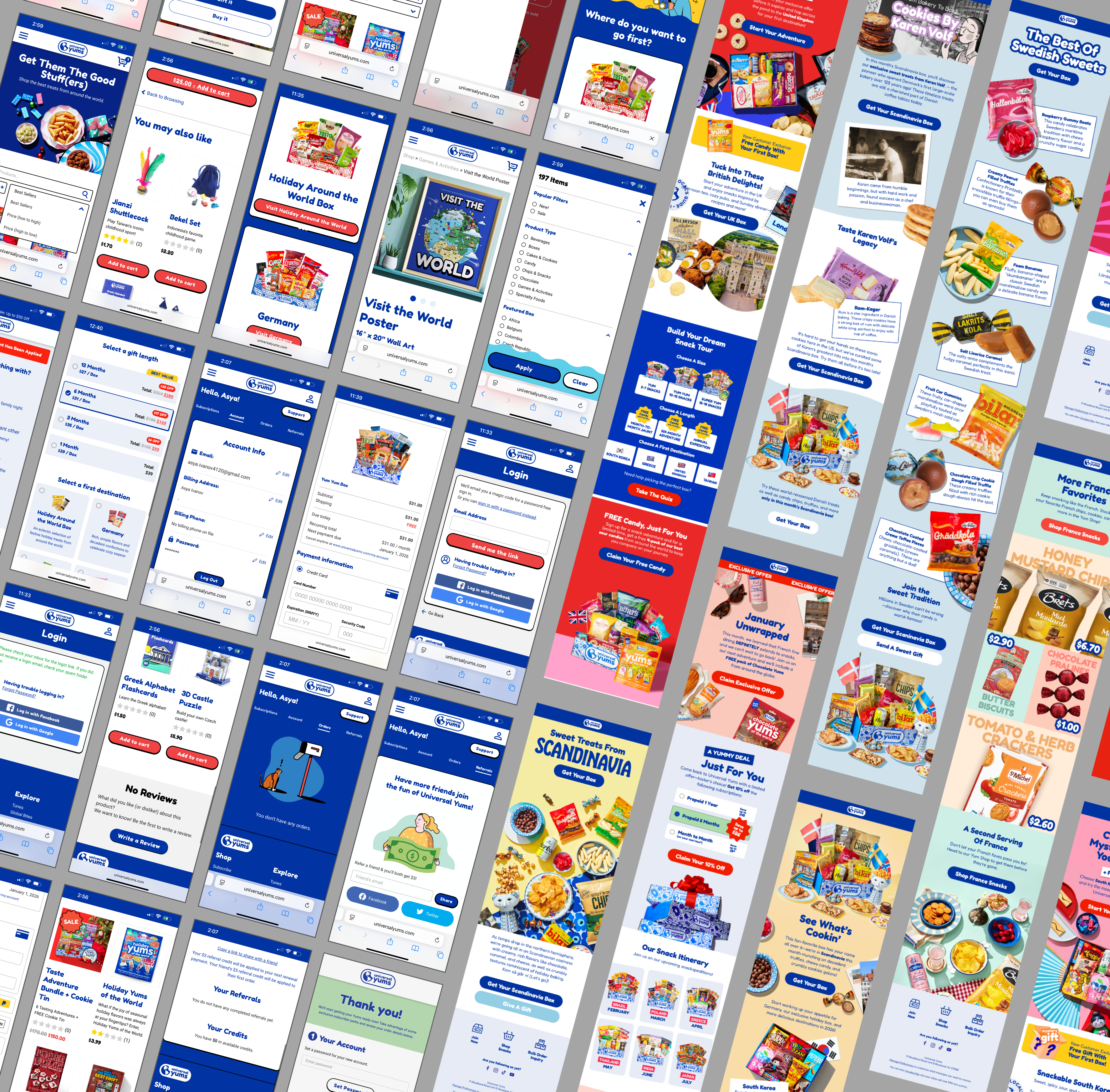
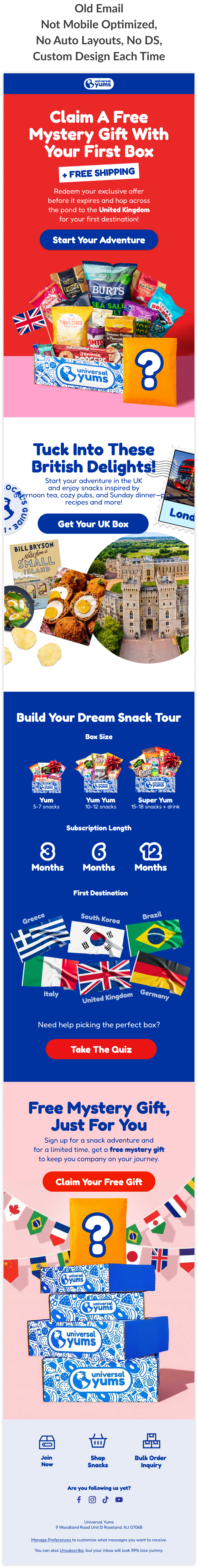
Email Template System
Universal Yums’ email campaigns were built as sliced images — meaning each email was a single exported graphic file. This approach is inaccessible (screen readers cannot parse image-only emails), unresponsive on mobile devices, and unmaintainable. Every campaign required a designer to rebuild the entire email from scratch.
I rebuilt the email system using a hybrid of live text and images, structured within the design system. The new template follows email best practices for width, spacing, type sizing, contrast ratios, and alt text. It is modular — sections can be swapped, updated, or reordered without rebuilding.
The result: an accessible, scalable email system targeting a 60% reduction in production time per campaign, with new designers able to onboard to the template in approximately 2 hours versus the previous approach of building from scratch each time.

Strategic Recommendations
(Approved · In Build 2026)
In parallel with delivery work, I conducted a full UX audit of the customer journey — reviewing existing flows, analyzing competitor approaches, studying Hotjar session recordings, and mapping the technical constraints of the WooCommerce stack. The outcome is a set of strategic recommendations approved by stakeholders for development in 2026.
Customer Flow: Before & After
Current flow (live):
- Landing page
- Mandatory taste quiz — required for all users, no skip option
- Country selector — choose box(es) and subscription length
- Checkout — no cart, no upsell, no subtotal review
Problems: The quiz creates unnecessary friction and a false sense that it generates personalized results — it does not. There is no cart, so customers cannot add à la carte Yum Shop items to their order. There is no opportunity for upsell before, during, or after checkout. The Yum Shop is invisible unless a customer navigates there directly.
Proposed flow (approved):
- Landing page — Homepage with Yum Shop surfaced in global navigation
- Product selection — Box tier, country, subscription length
- Cart — Review order, see subtotal, encounter curated upsell items
- Checkout — Streamlined, with upsell accessible post-purchase
Quiz Redesign
The current taste quiz is mandatory and produces no actionable result — completing it does not change what a customer is shown or recommended. It is a point of friction with no payoff.
My recommendation, approved for build: make the quiz optional and available at any point in the journey — useful for customers who are undecided between country boxes, but not a barrier for customers who already know what they want. I redesigned the quiz UI and content for clarity and engagement, and proposed integration of a vector database to generate genuinely personalized results based on a customer’s flavor preferences. This is supported by competitor research showing how leading subscription brands handle preference-matching.
Information Architecture & Navigation
The Yum Shop — where customers can purchase individual snacks à la carte — is absent from the global navigation. This makes repeat purchases and product discovery invisible to customers who don’t already know the shop exists. My IA proposal surfaces the Yum Shop into the main navigation and adds a cart accessible site-wide, enabling upsell opportunities throughout the session.
Accessibility Standards
I introduced a documented accessibility baseline across the design system: WCAG AA color contrast for all text and interactive elements, focus states on all interactive components, minimum touch target sizing, and alt text standards for email. These are now embedded in the design system and available to all designers and developers as a reference.
Results
Brand Consistency
For the first time, web and email share a single visual language. The design system gives all four designers — previously working in isolation across web, email, packaging, and illustration — a common foundation to build from.
Scalability
The design system is adopted and in use across web and email. Campaign page templates exist and are reusable. Components are documented for developer use. New designers can onboard to shared standards. The team can now build without starting from scratch.
Workflow Efficiency
Email production shifted from bespoke, inaccessible sliced-image builds to a templatized, accessible system targeting a 60% reduction in production time per campaign. New designers can onboard to the template system in approximately 2 hours, compared to the previous 2-week ramp-up of learning to build emails from scratch. Design-to-developer handoff improved through documented components and closer collaboration. Silos between design and development are reduced.
Transaction Potential
The cart and upsell flow is approved and queued for build in 2026. Holiday landing pages delivered mobile-optimized experiences for the company’s primary traffic source — mobile users arriving via email. Yum Shop surfaced in navigation will increase à la carte purchase visibility. The optional quiz and personalized results will reduce drop-off at the top of the funnel.
Reflection
Working as the sole UX practitioner in a marketing-led organization with no prior design infrastructure required a different approach than a typical product design engagement. The design work itself was only part of the challenge — equally important was introducing new ways of working, building trust with a team unfamiliar with UX methods, and making recommendations legible to stakeholders whose primary frame was marketing and business operations, not user experience.
If I were starting this engagement again, I would introduce the design system even earlier and involve the development team in its creation from the beginning. Their early input would have reduced back-and-forth during handoff and created earlier buy-in for the component structure. The lesson: in organizations without existing design infrastructure, the social and organizational work of establishing new practices is as important as the design work itself.