Apptopia — Marketing Website
Rebuilding Apptopia's marketing site from a dated, hard-to-maintain structure into a scalable, modular system — with a refreshed visual language to match a growing B2B product.
Refreshing an existing company site is a particular kind of challenge — it means working within an established brand context, moving quickly alongside other product work, and making decisions that serve the business for years without the luxury of a ground-up brief. This project was all three.
I worked as one of two designers on Apptopia’s marketing site redesign, contributing to content strategy, information architecture, the visual system, and component library.
Discovery: What Wasn’t Working
Before designing anything, the team assessed the limitations of the existing site. Three problems were consistent across the audit.
Content couldn’t keep up with the product. Adding new information required workarounds — the layout was rigid, and pages didn’t accommodate different amounts of content without breaking. As Apptopia’s product grew, the site fell behind.
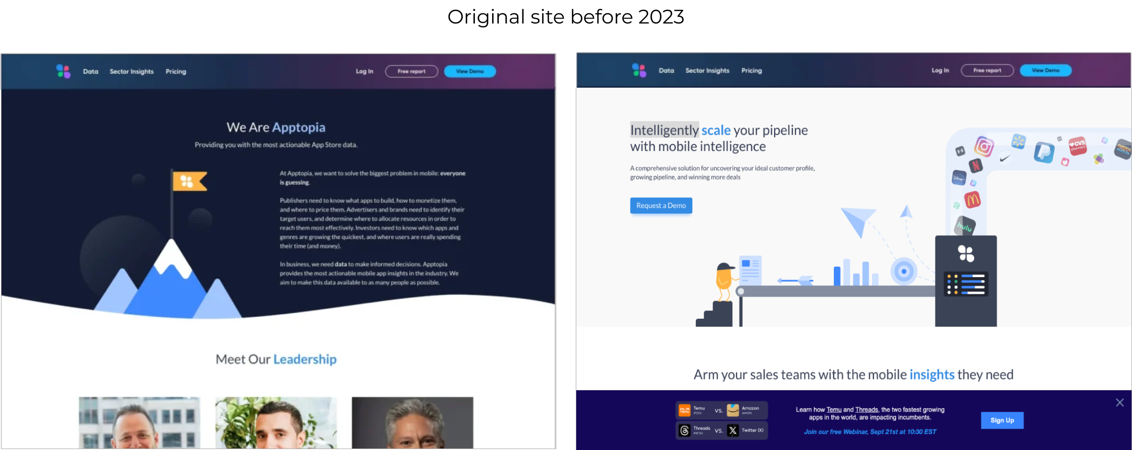
The visual design felt dated. The existing aesthetic no longer reflected the quality of the product or the expectations of enterprise buyers. It had accumulated design decisions from different eras without a unifying direction.
Imagery was inconsistent and hard to replicate. Custom visuals had been created ad hoc over time, with no documented system. Producing new assets that felt cohesive with existing ones was difficult and time-consuming.
Discovery: Mapping the Content
Before any visual work began, I ran a FigJam session with the project owner to map out everything the homepage needed to communicate. This covered the full content hierarchy — what Apptopia offers, how it differentiates, what a prospective enterprise customer needs to understand before making contact, and in what order. Getting this right early prevented the common trap of designing a polished page around the wrong content.
Exploration: Shaping the Visual Direction
With content requirements established, I moved into a broad exploration phase — gathering competitive and inspirational references, testing different approaches to section construction, and building up a working visual vocabulary. This phase was deliberately generative: the goal was to surface options and understand the space before committing to a direction.
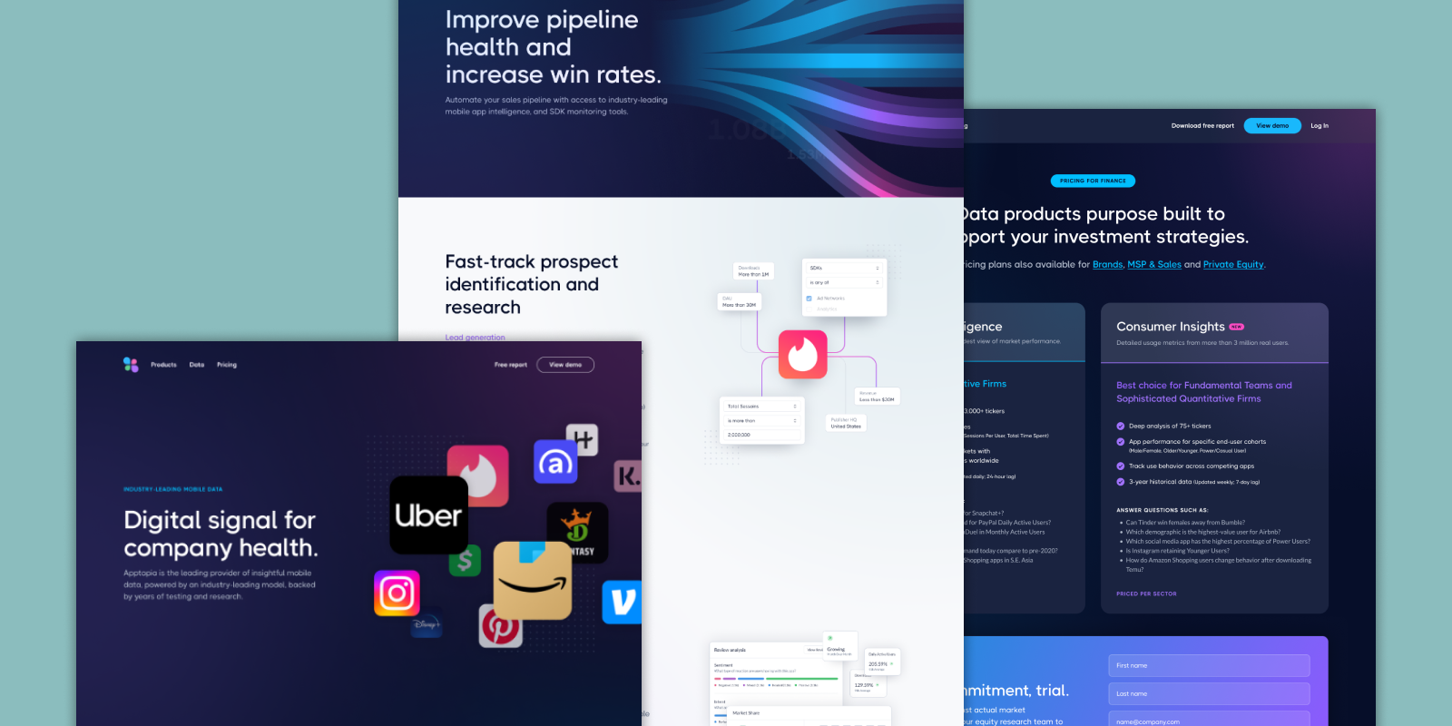
Three Stylistic Directions
From the exploration phase, three distinct visual directions were developed and presented to the marketing team. Each carried a different aesthetic character and implied a different market positioning — giving stakeholders a real choice rather than a single concept to rubber-stamp.
Iterating on the Chosen Direction
With a direction selected, the work shifted to refinement. This phase worked through navigation structure, page layout, animation approach, and iconography — each resolved through rounds of iteration and internal review before being finalized for build.
Local Component Library
Apptopia had an established design system for its core product — but nothing existed for the marketing website. Rather than retrofit the product DS or build components ad hoc, I created a local component library specific to the marketing site: the building blocks needed to construct every page consistently and hand off to engineers with precision.
The Redesigned Site
A key structural goal throughout was flexibility. Apptopia sells multiple product packages, each requiring its own page with varying amounts of content. The modular page architecture accommodates different content lengths, section orders, and product focuses without requiring custom layouts for each.

Outcome
The redesigned site gives Apptopia a visual language that reflects the caliber of its product and the expectations of its market. More practically, it gives the marketing team a system they can actually use — text and images can be updated without breaking layouts, new product pages can be added using existing components, and the visual direction is documented well enough to be handed off and maintained.