Apptopia — Web App Feature Design
Designing a net-new prospecting feature for Apptopia's enterprise customers — translating complex data requirements into a focused, filterable publisher list builder.
Discovery: Business Need
Apptopia is a mobile data intelligence platform used by business development, research, and investment teams at enterprise companies to identify prospects, track competitors, and surface market trends. The platform surfaced rich data at the app level — but app-level data was creating a structural problem for a core customer segment, and it was showing up directly as churn.
Apptopia’s MSP customers — business development teams at companies selling mobile SDKs, developer tools, and enterprise services — needed to prospect at the publisher level. Publishers are the companies that build and distribute apps; a single publisher may own dozens or hundreds of apps across the app stores.
The platform only returned data at the app level. To get a publisher-level view, customers were manually exporting results and aggregating them in spreadsheets — a time-consuming workaround that introduced errors and created false negatives in prospect lists. A publisher whose individual apps didn’t clear a performance threshold might be a strong prospect when their full app portfolio was considered together. The product was causing customers to miss qualified leads.
By the time the project was scoped, at least two customers had churned specifically because the platform couldn’t generate publisher-level prospect lists. Eliminating prospecting deficiency as a reason for churn was an explicit project goal.
Understanding the User: Who Needs This and Why
Working closely with product management, I mapped existing user journeys inside Apptopia and conducted research across three distinct user types whose needs were surfacing in the data:
MSP / Business Development Reps — the primary use case. Teams like Google Firebase’s BDR function needed publisher prospect lists filtered by performance thresholds, technology adoption signals (which SDKs a publisher is installing or uninstalling — a signal of competitive intent), app traits, and geography. They needed to export results to CRM systems and receive scheduled updates when new publishers entered a saved list.
Market Researchers — users at consulting firms like McKinsey needed rolled-up usage data specifically for the apps that contributed to a publisher’s inclusion in results, not the publisher’s full portfolio — a meaningful distinction for category-level trend analysis.
VC/PE Investors — partners at investment firms needed publisher-level screening by company status (private vs. public), compound growth rate, and performance thresholds over time to identify high-quality investment targets.
The three use cases shared a common need — a publisher-level view — but with different filter requirements, data presentations, and output formats. This shaped the filter architecture directly.
Definition: Filter Taxonomy
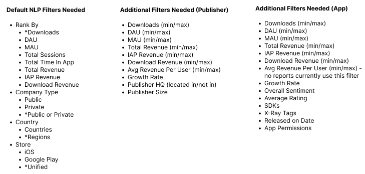
A critical early finding: the filters required fell into two technically distinct categories with different backend implementations and direct implications for the UI.
Publisher-level filters evaluate the publisher’s aggregate footprint — total downloads across all their apps, revenue, company size, headquarters location, compound growth rate. A publisher either meets the threshold or doesn’t, based on the sum of their portfolio.
App-level filters evaluate individual apps within a publisher’s portfolio — SDK adoption, X-Ray tags, app permissions, store ratings, sentiment. A publisher can be included in results if any one of their apps meets these criteria, or if the aggregate of their apps does — two meaningfully different queries.
Making this distinction legible in the UI was not a labeling choice — it was a data architecture boundary. Mixing the two filter types without surfacing the difference would undermine the accuracy and trustworthiness of every query a user ran.
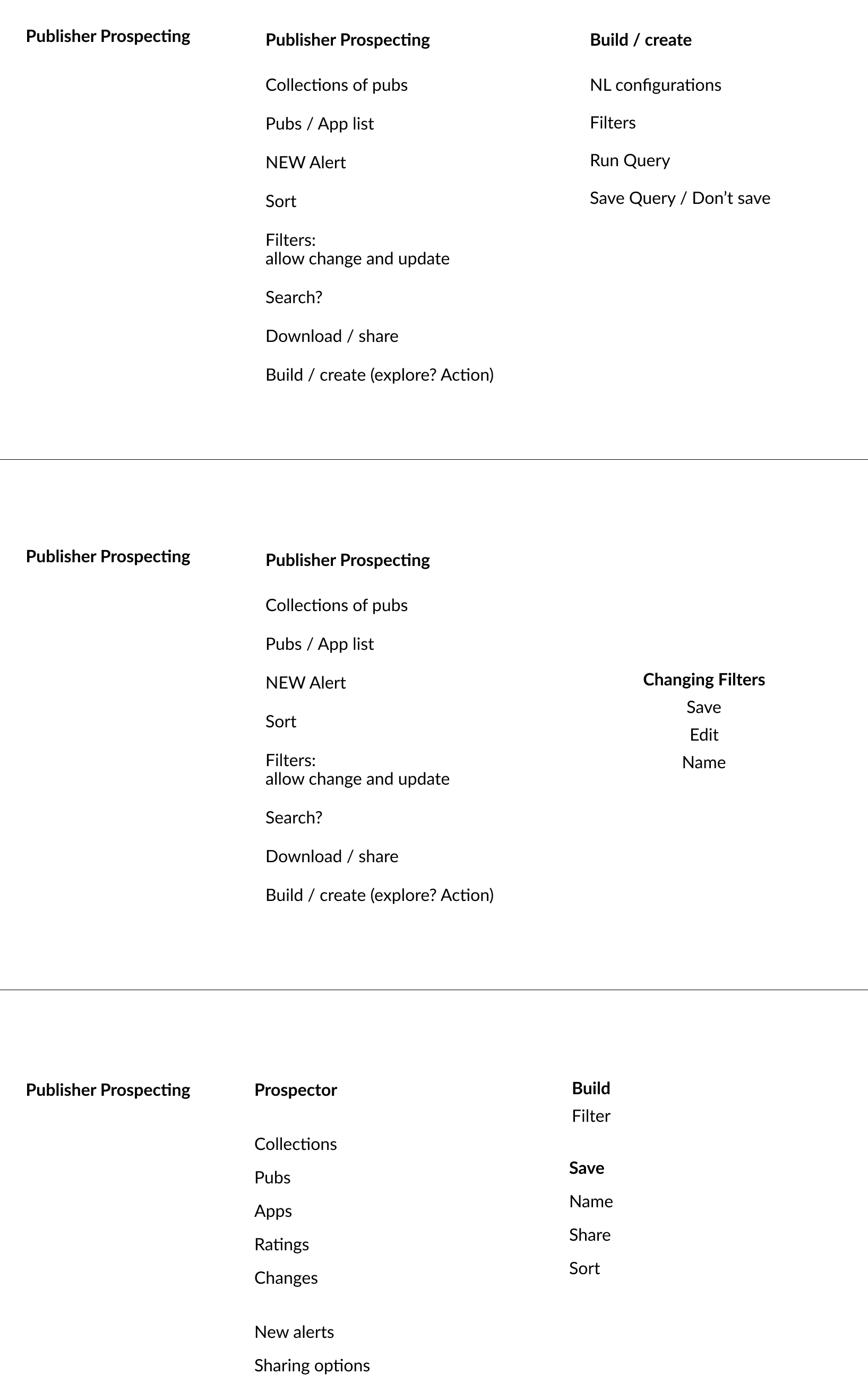
Exploration: Interface Concepts
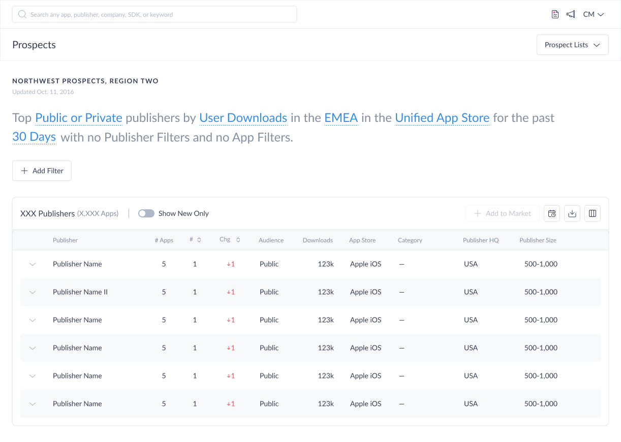
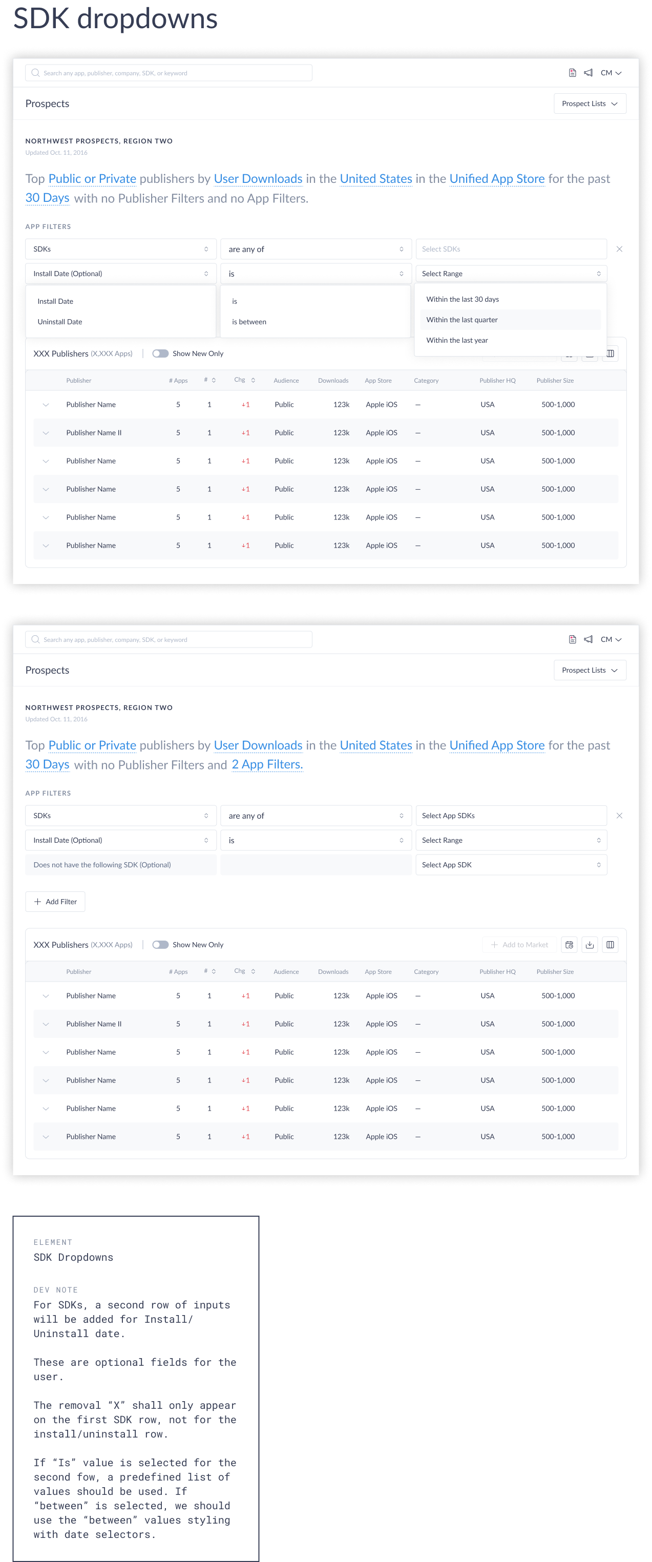
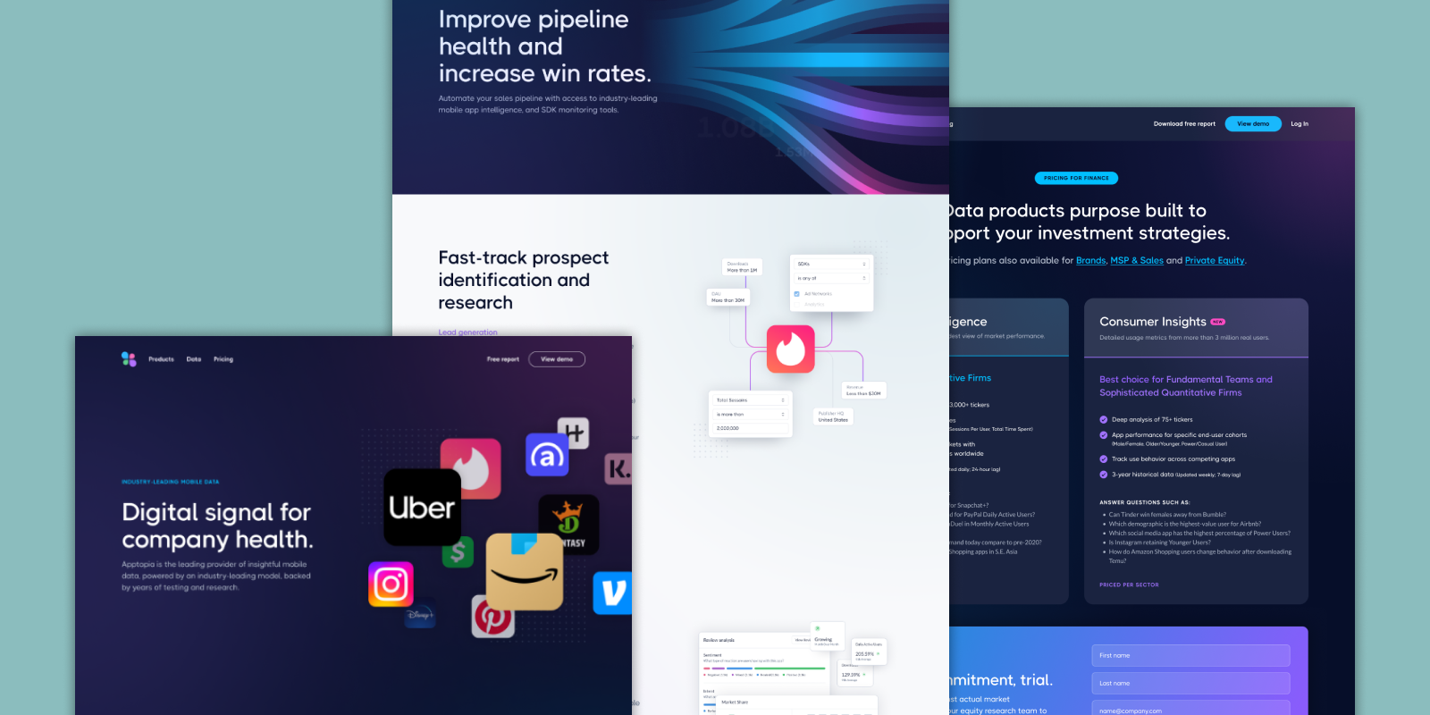
The early interface concept established two distinct filter layers. At the top, a natural language sentence — Top Public or Private Publishers by Downloads in the United States for the Last 30 Days in the Unified app store — defined the primary query parameters through editable, interactive segments. Below it, an “Add Filter” button opened a secondary filtering UI where users could layer in additional criteria: selecting either a Publisher or App filter via radio button, then building a condition through a three-part dropdown row — attribute, operator, and value — with a close icon to remove it.
The open design question at this stage was how these two layers should relate to each other. Should the NLP sentence dynamically update to reflect every additional filter the user added — making the full query readable at a glance? Or should the NLP control only the top-level parameters, with additional filters treated as a separate, explicitly labeled section below?
Ideation: Exploring Three Potential Directions
Three directions were then explored for how users would access and distinguish between Publisher and App filter types:
- Single button — one entry point housing both publisher and app filters, with a dropdown menu to select type
- Two separate buttons — an explicit split letting users consciously choose which filter category to apply
- Global nav exposure — surfacing saved prospect lists through the top navigation for discoverability
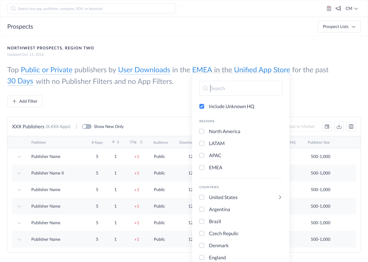
Final Filter UI Design
After extensive internal review, iteration, and rounds of user testing, the team landed on the single button with dropdown approach. The full flow works as follows: below the NLP, an “Add Filter” button opens a dropdown with two options — “Publisher Filter” and “App Filter.” Once the user selects one, a labeled section appears beneath the NLP — “Publisher Filters” or “App Filters” — containing a filter row with three dropdown selectors for the filter attribute, operator, and value. Additional filters can be stacked the same way, and each row carries a close icon to remove it individually.
Filter Interaction: Natural Language Pattern
With the entry point resolved, the next design decision was how individual filters would be constructed. The solution uses a natural language pattern — each filter is composed of three parts: a filter (the data attribute), an operator (the relationship, such as “is at least”, “is not located in”, or “is any of”), and a value (the specific input).
This structure maps closely to how BDRs already think about their criteria: publishers with downloads of at least 1 million, headquartered in the United States, using a competitor SDK. Translating that mental model directly into a UI interaction reduces cognitive load and makes complex multi-condition queries approachable for first-time users.
The natural language structure at the top of the interface — defining the primary sort metric, geographic scope, time period, and app store (iOS, Google Play, or unified) — set the foundational query parameters. Publisher-level and app-level additional filters were layered beneath, explicitly grouped and labeled to preserve the architectural distinction.
The pattern also scales cleanly: the same three-part structure works for a simple single-filter query and for a compound list combining publisher performance thresholds, SDK adoption signals, and app sentiment filters.
Three Additional Challenges: 1. Publishers with Large App Portfolios
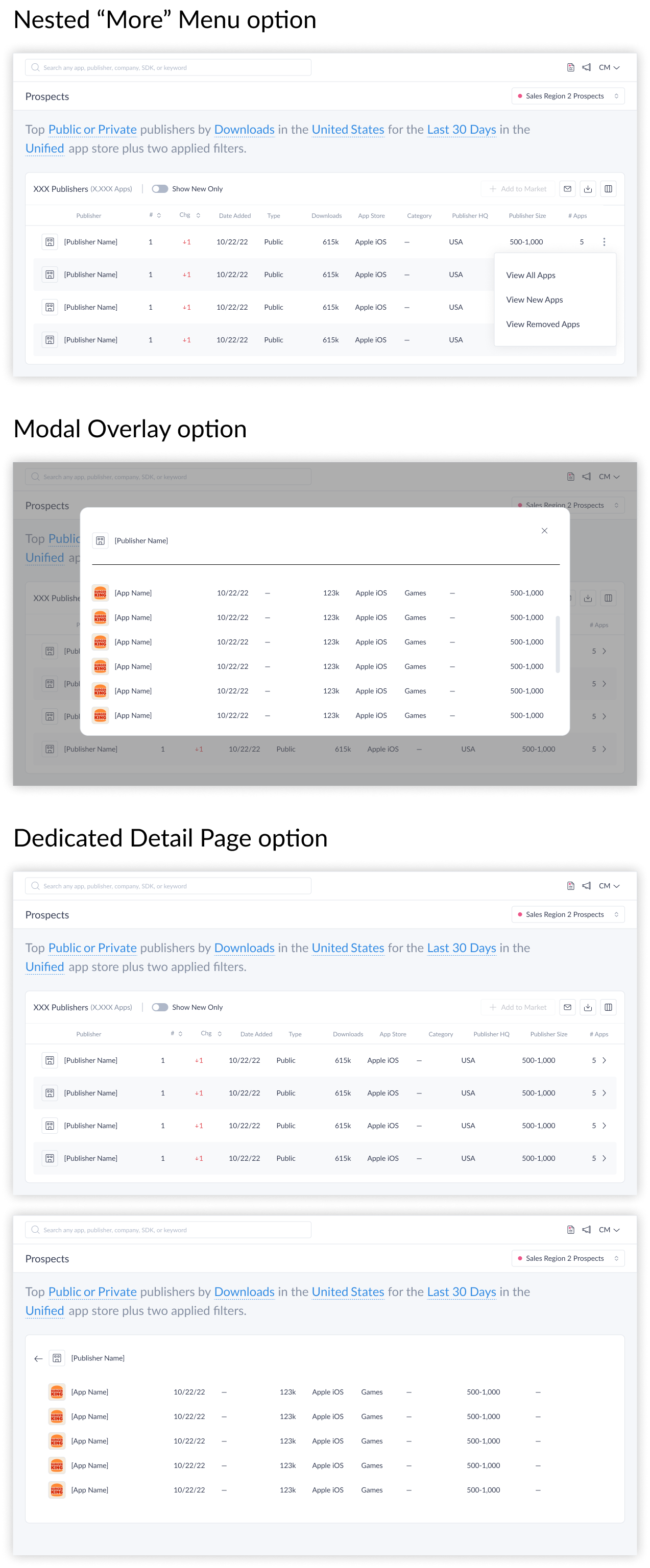
The results table was designed with expandable rows — each publisher row could be expanded to reveal the specific apps contributing to their inclusion, along with app-level metrics. This was core to the McKinsey use case and to any user doing due diligence on a specific publisher.
A secondary challenge emerged: publishers with large app portfolios created a detail-density problem. Three approaches were evaluated for how much to show inline and how users access the rest:
- A nested “more” menu within the publisher row
- A modal overlay showing the publisher’s full app list
- A dedicated detail page with breadcrumb navigation back to the list
Challenge 2: Discoverability of Updates
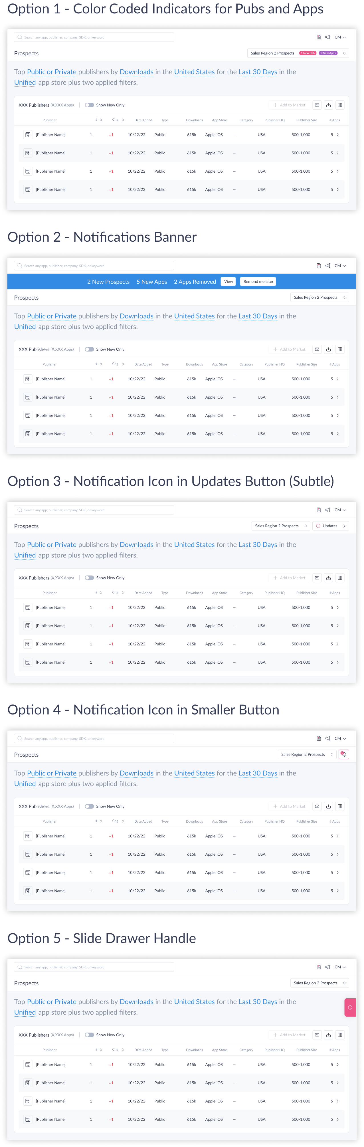
A third problem: when new publishers were added to a saved list, users had no clear signal that anything had changed. For BDRs who returned to saved queries regularly to work new results, a static-feeling list undermined one of the feature’s core value propositions. Five visualization approaches were tested with users. Option 5, which surfaced change indicators most explicitly, was the clear preference.
Challenge 3: Surfacing Saved Prospect Lists
Solving for update visibility made one thing clear: the existing approach of surfacing a single list by name in the sub-nav wasn’t enough — users needed a real home for their saved prospect lists, one that could support ongoing, active use.
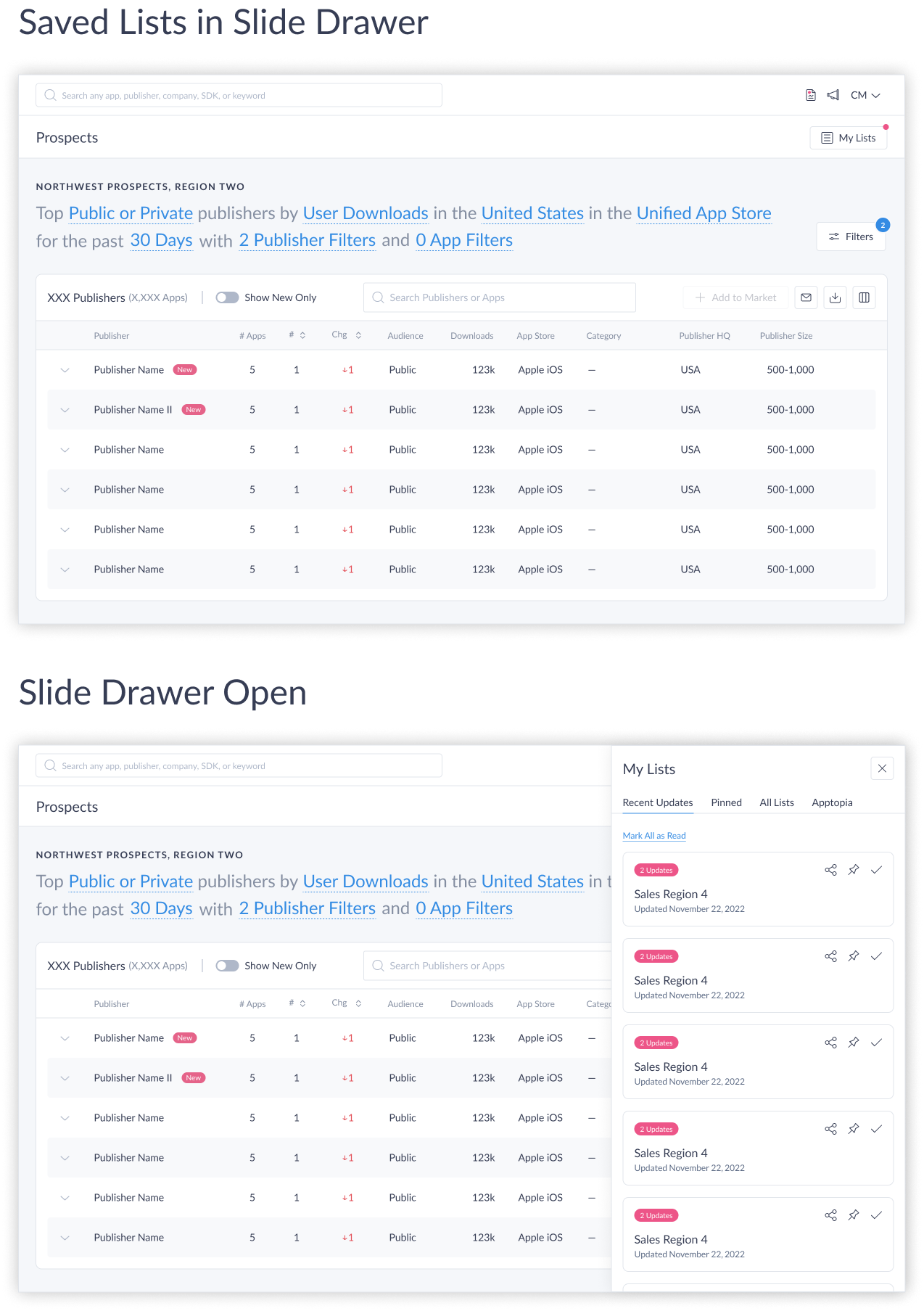
A key design decision was how users would manage and navigate their saved prospect lists. An early direction surfaced saved lists as a side drawer — accessible without leaving the current view. The team was aligned on it, until we took a closer look at how to surface updates within those lists. Solving one challenge had broken another: the drawer didn’t have a clean way to communicate when a list had new results.
To solve both problems together, I proposed changing the sub-nav button from the prospect list name to a persistent “My Lists” button, with a small pink dot indicator appearing when any list had updates. Clicking the button would open the drawer, which contained tabs — the first being “Recent Updates,” showing cards for every list with new activity. The indicator made updates impossible to miss; the drawer kept the full list library a single click away without ever pulling users out of their current context.
As the drawer direction matured, a new problem surfaced: customers with large numbers of saved lists would face an indefinitely long scroll inside the panel — a pattern that works on social media but not in a tool built for focused prospecting work. I brought a new solution to the table: an apron UI with tabs and list cards arranged in a three-column grid. The apron gave the library real structure — scannable, organized, and free of infinite scroll. The team and VP of Product responded to it strongly.
That opened a new challenge to solve: the apron sat on top of the current page, which raised practical questions about where it originated in the UI, how it would be triggered, and whether it could integrate cleanly into the existing app architecture — or whether we were back to finding something else entirely.
Final Design
The answer to the integration question was in how the apron behaves: rather than floating as an overlay on top of the page, it pushes the content below it down. This meant it could be triggered by a “Prospect Lists” button in the sub-nav — opening and closing cleanly as part of the page flow, with no architectural conflict.
The final design handles two distinct states. When a user has updates in their saved lists, the apron opens by default. A pill indicator in the global side navigation shows how many lists have new activity, so users know before they even reach the page. Inside the apron, three tabs — All, Apptopia Suggested, and Favorites — each display how many lists they contain. Updated list cards float to the top of the All tab, each with a pill showing the number of newly added publishers. Cards support quick actions — dismiss as read, save to favorites, and more. The card with the most significant updates is pre-selected, and its full content — NLP filters, additional filters, and the publisher results table — loads immediately below the apron, so the user lands in a working state without any extra navigation.
When there are no updates, the experience steps back: no pill in the global nav, apron collapsed, most recently accessed list loaded and ready. If the user wants to switch lists or browse their library, the “Prospect Lists” button opens the apron — pushing everything down to make room — and collapses it again when dismissed.
Results
The feature shipped and received immediate positive feedback from Customer Success Management and end users. Adoption was strong across both experienced and new users — validating that the natural language structure and progressive disclosure reduced the learning curve for a genuinely complex feature.
The prospecting gap was eliminated as a tracked churn reason — the direct outcome the project was scoped to achieve.
Reflection
Feature design inside an established product requires a different discipline than building from scratch. Every decision has to reckon with what already exists — the mental models users bring, the components and patterns in the design system, and the technical constraints baked into the platform.
The publisher vs. app-level filter distinction is the clearest example from this project: what looks like a UI labeling decision is actually a data architecture boundary. Surfacing it clearly in the interface — rather than flattening it into a single filter panel — made the feature more accurate, more learnable, and more trustworthy. Getting that distinction wrong early would have created compounding problems across every design decision downstream.
Working closely with product management from the beginning — rather than receiving a spec and designing against it — was essential on a feature of this complexity. The filter taxonomy we arrived at together was more complete and more technically grounded than either of us would have produced independently. On a project with this many moving parts across multiple user types and phased scope, that kind of cross-functional alignment at the start is the difference between a coherent system and a fragmented one.